Kerr Advisory

About
My client, Brittney Kerr, is a senior corporate affairs executive specializing in government relations, strategic communications, advocacy campaigns, and community engagement. Her experience spans various sectors – including the private sector, government, Indigenous communities, and not-for-profit organizations – which collectively shape her advisory work today.
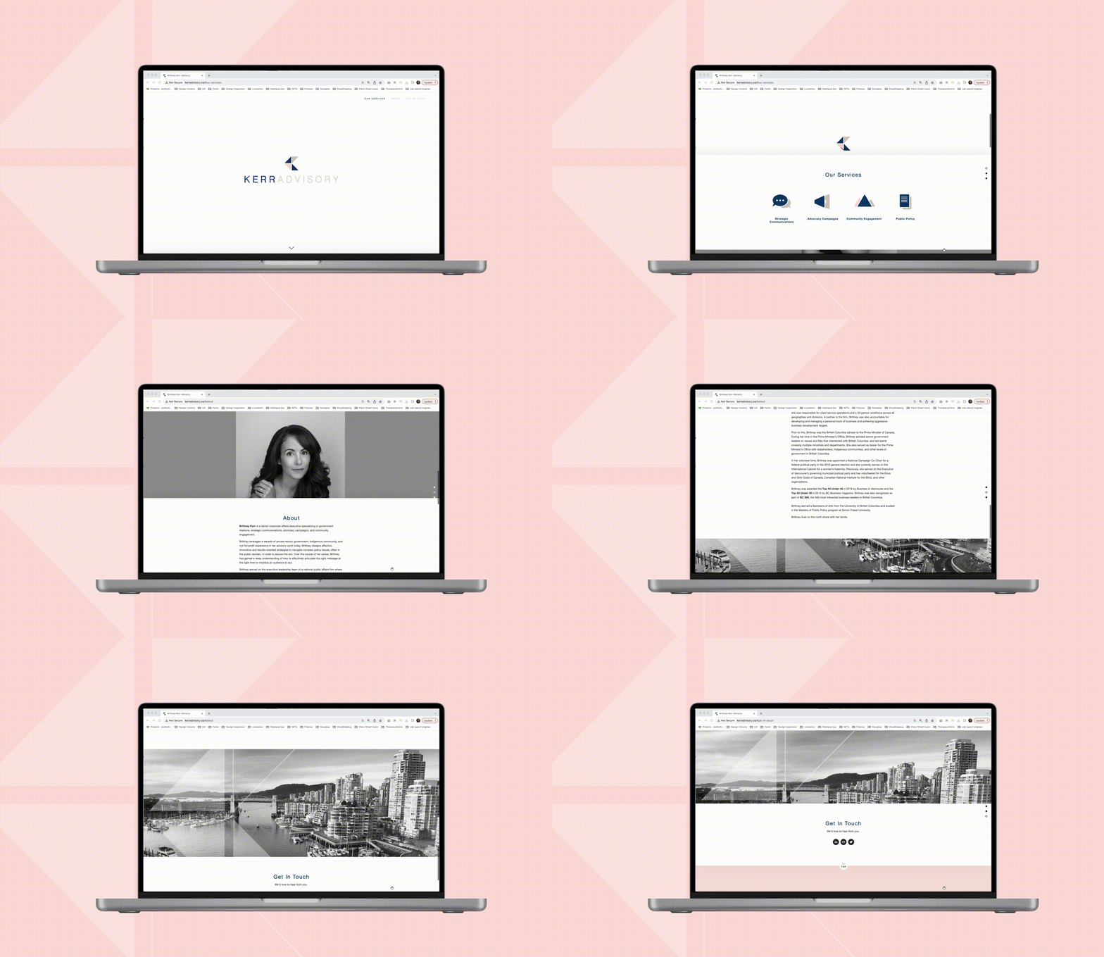
Due to her engagement with multiple sectors, she required a comprehensive brand and website solution for her services. Her vision was clear: a simple, informative website aligned with her preferences. She aspires to be branded as sophisticated, strategic, expert, confident, and feminine. The resulting brand is clean, versatile, and tailored to her distinctive style.

Logo & graphics development
The logo icon is a monogram of BK, where each triangle signifies distinct sectors BK collaborates with – such as legislature, community, clients, and more. This unique configuration encapsulates the spirit of collaborative effort across these sectors, uniting towards a shared objective. The gentle pink hue further embodies the essence of Brittney Kerr, infusing a touch of her personality.
Moreover, the icon serves as a versatile branding graphic, adept at enhancing storytelling or drawing attention to specific subjects. Its flexibility allows it to seamlessly integrate with various contexts, enriching the narrative or spotlighting the focal point.

Final logo solution

Website Solution
The website features a parallax effect, enhancing its dynamism and creating a sense of depth even with minimal content. Employing a black and white palette for the images serves to emphasize icons and the logo, contributing to a clean and focused visual presentation. This deliberate design approach enables viewers to concentrate on the information, resulting in a polished and engaging user experience.

Business cards
In harmony with both the website and the brand identity, the business cards maintain a consistent essence of cleanliness, sophistication, and directness. To impart a subtle yet impactful accent, we incorporated a clear varnish, reminiscent of the delicate pink hue found in the logo. These meticulous details pay homage to Brittney's distinctive personal touch, resulting in a business card design that seamlessly aligns with her overall brand vision.

My role: Identity Creation | Brand Development | Designer